
COPOZZ
Sporty and Potential
-
COPOZZ is a new generation brand dedicated to providing professional and reliable equipment for outdoor athletes to explore their potential. By pursuing the delicate balance of physical and aesthetic details, we give each product high quality and exquisite creativity. COPOZZ always believes in "Sporting Style, Potential without Boundaries", encouraging everyone to explore their potential and enjoy the fun of outdoor sports in a cooler and more trendy way.
COPOZZ 酷破者
运动有型,潜能无界
-
酷破者,一个致力于为户外运动者的每一次潜能探索提供专业可靠装备的新生代品牌。通过追求细节上体感和美感的精妙平衡,为每件产品赋予高品质及精巧的创意。酷破者始终相信“运动有型,潜能无界”,鼓励每个人发掘自我潜能,用更潮酷的姿态,享受户外运动带来的乐趣。

Inspired by "Sports Trends"
Creative interpretation of the brand name
-
We analysed the brand in depth and gave it a deeper and more relevant interpretation, so that the brand could understand itself more clearly, thus conveying a more accurate brand attitude and perception to consumers.
Creative interpretation of the brand name
-
We analysed the brand in depth and gave it a deeper and more relevant interpretation, so that the brand could understand itself more clearly, thus conveying a more accurate brand attitude and perception to consumers.
酷: to establish a cool style, and to understand the hotspots of interest;
破: Deciphering the trend code and penetrating into the youth circle;
者: fashion with new ideas, rebels.
破: Deciphering the trend code and penetrating into the youth circle;
者: fashion with new ideas, rebels.
CO: combine, fusing multiple aesthetics;
PO: popular, with its own pop gene;
Z: zippy, agile and full of energy;
Z: zone, a fashion zone with unique style.
PO: popular, with its own pop gene;
Z: zippy, agile and full of energy;
Z: zone, a fashion zone with unique style.
以“运动潮流”为灵感引擎
延伸出品牌名的创意拆解
-
我们深度剖析品牌,给予品牌更深层的、更贴合的解读,让品牌更清晰的了解自己,从而向消费者传递更准确的品牌态度与认知。
酷:树立酷我型格,洞察兴趣热点;
破:破译潮流密码,打入年轻圈层;
者:新意迭出的时尚,叛逆者。
破:破译潮流密码,打入年轻圈层;
者:新意迭出的时尚,叛逆者。
CO:combine,融合多元审美;
PO:popular,自带流行基因;
Z:zippy,敏捷而充满元气的存在;
Z:zone,一处独具风格的时尚地带。
PO:popular,自带流行基因;
Z:zippy,敏捷而充满元气的存在;
Z:zone,一处独具风格的时尚地带。

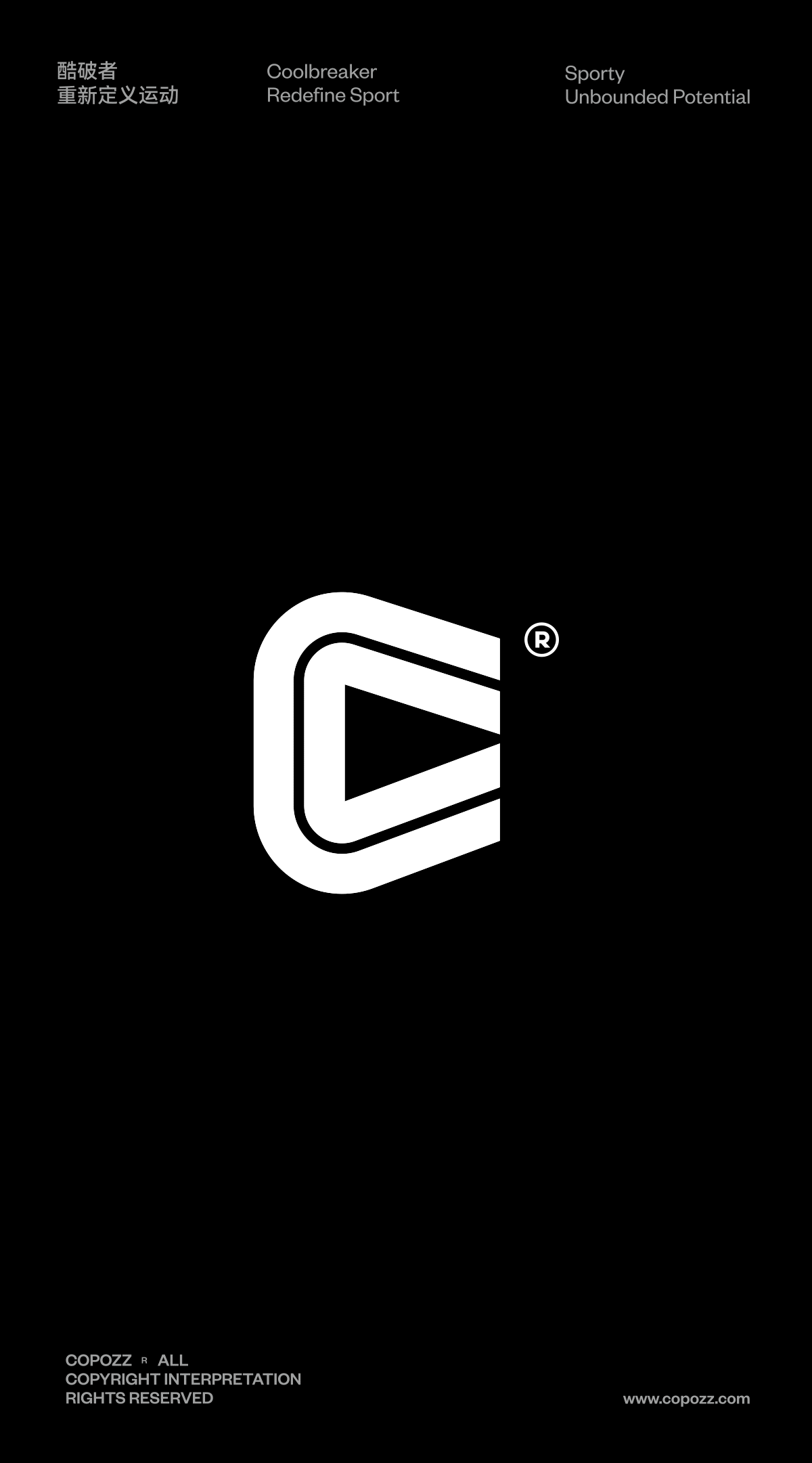
The evolution of C
Let movement and life go hand in hand
-
Taking the initial C for the graphic design, two lines are used to form the stripes, which is a clever fusion of the concepts of "the track of movement" and "letting the fun of movement go hand in hand with life", so that the spirit of the whole brand can be sublimated again. In the middle of the graphic, a negative space is formed, like a play button, implying upward breakthrough, exploration, aggressiveness and innovation.
C的演变
让运动与生活并行
-
取首字母C进行图形化设计,选用两条线组成条纹,是“运动的轨迹”与“让运动乐趣与生活并行”这两个概念的巧妙融合,让整个品牌的精神得到再次升华。图形中间构成一个负空间,如同一个播放键,寓意着向上突破、探索、进取与创新。
让运动与生活并行
-
取首字母C进行图形化设计,选用两条线组成条纹,是“运动的轨迹”与“让运动乐趣与生活并行”这两个概念的巧妙融合,让整个品牌的精神得到再次升华。图形中间构成一个负空间,如同一个播放键,寓意着向上突破、探索、进取与创新。

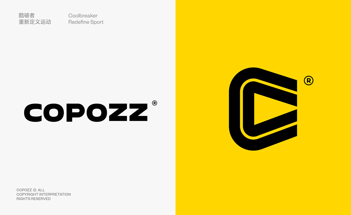

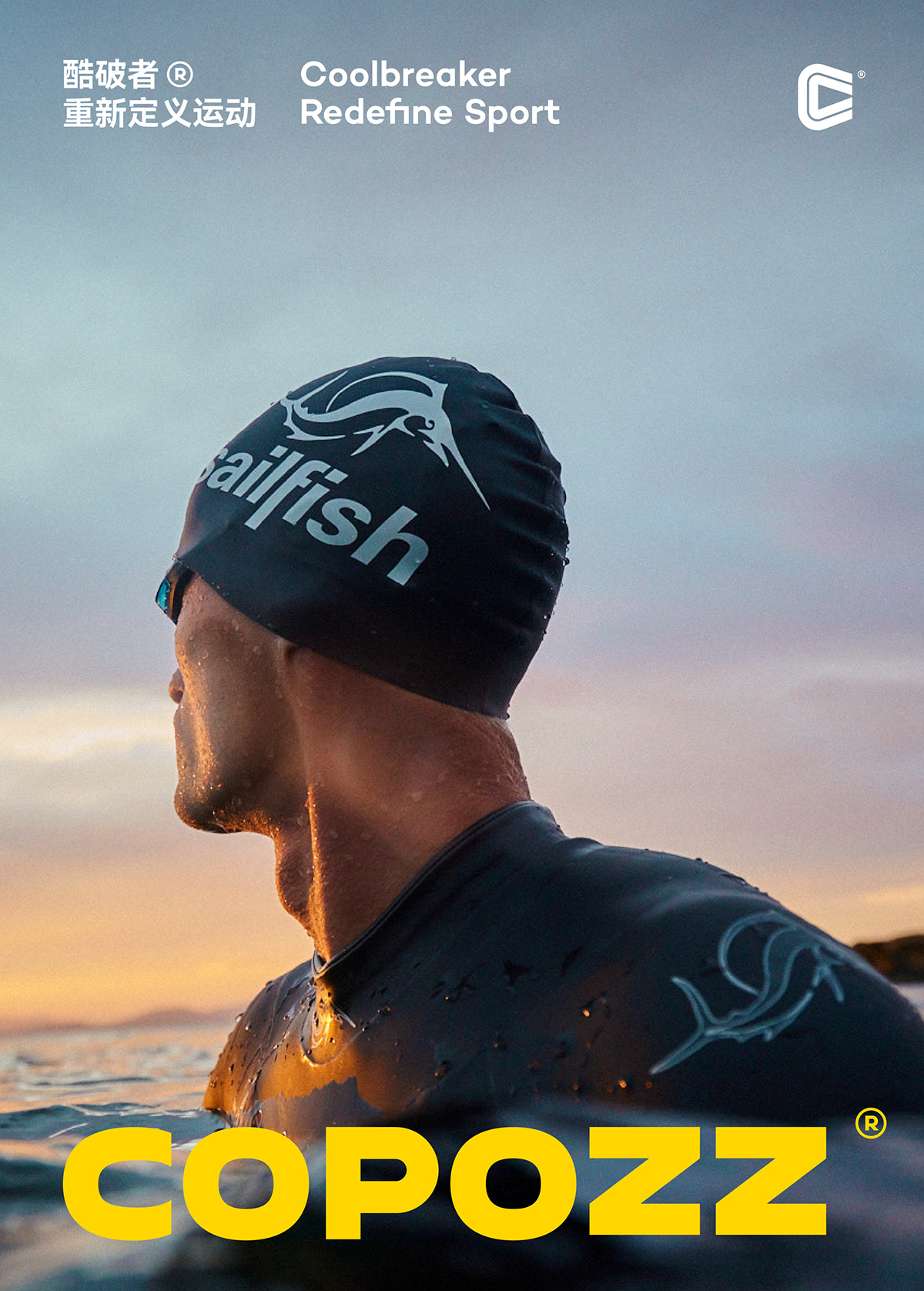
Vibrant Yellow:
A vibrant trend factor
-
Unlike traditional sports brands, COPOZZ believes in the power of the trend factor, that fashion is closely related to everyone, and that every outfit is an expression of attitude. Energetic yellow is the upward energy, the leaping vitality, the colour of youthful power that can't be ignored. It is the colour of youthful power that can't be ignored. It is used as the brand's colour to fit the brand's concept and create the brand's temperament of sporty, fashionable and technological trend.
活力黄:
跃动的潮流因子
-
与传统运动品牌不同的是酷破者崇尚潮流因子的力量,认为时尚与每个人息息相关,每一种穿搭,都是一此态度的表达。活力黄,是向上的能量,是跃动的活力,是拥有年轻力量且无法被忽视的色彩。以此作为品牌色以契合品牌理念,打造运动、时尚、科技潮流的品牌气质。


Outdoor Sports Adventure Officer:
KUPO, Little K
-
Auxiliary IP image design - KUPO, a.k.a. Little K. The appearance is an upward triangle, but without the sharp pointy corners, which signifies breakthrough and forward movement, as well as uniqueness and inclusiveness. It can be used for themed or children's products as well as some peripherals, thus increasing the brand's extensibility.
户外运动探险官:
KUPO,小K
-
辅助IP形象设计——KUPO,又名小K,外观是一个向上的三角形,却没有了锐利的尖角,既寓意着突破与向前,也代表了独特与包容。可用于主题款或儿童款产品以及一些周边,从而增加品牌的可延展性。
KUPO,小K
-
辅助IP形象设计——KUPO,又名小K,外观是一个向上的三角形,却没有了锐利的尖角,既寓意着突破与向前,也代表了独特与包容。可用于主题款或儿童款产品以及一些周边,从而增加品牌的可延展性。


